• C++ Programming for Financial Engineering
    Highly recommended by thousands of MFE students. Covers essential C++ topics with applications to financial engineering. Learn more Join!
    Python for Finance with Intro to Data Science
    Gain practical understanding of Python to read, understand, and write professional Python code for your first day on the job. Learn more Join!
    An Intuition-Based Options Primer for FE
    Ideal for entry level positions interviews and graduate studies, specializing in options trading arbitrage and options valuation models. Learn more Join!

Efficient Frontier looks weird

Joined
12/25/20
Messages
13
Points
11
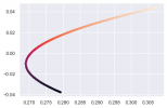
Hi all, could you please help me identify if there is anything wrong in my code? And if nothing is wrong, could you please let me know why the graph looks weird?


Efficient Frontier:
# -*- coding: utf-8 -*-
"""
Created on Wed Jan 13 17:03:13 2021

"""

import pandas as pd
import numpy as np
import matplotlib.pyplot as plt
import seaborn as sns
sns.set()
from math import *
from scipy.optimize import minimize
pd.set_option('display.max_rows', 10)
pd.set_option('display.max_columns', 10)
import pickle

from pandas_datareader import data as wb
tickers=['F','GM']
data=pd.DataFrame()
for t in tickers:
    data[t]=wb.DataReader(t, data_source='yahoo', start='07-5-2012', end='5-7-2020')['Adj Close']
log_returns=np.log(data/data.shift(1))
num_ports=50000
ret_array=np.zeros(num_ports)
all_weights=np.zeros((num_ports, len(data.columns)))
vol_array=np.zeros(num_ports)
sharpe_array=np.zeros(num_ports)
for ind in range(num_ports):
    weights=np.random.random(2)
    weights=weights/np.sum(weights)
    all_weights[ind,:]=weights
    ret_array[ind]=np.sum(weights*log_returns.mean()*252)
    vol_array[ind]=sqrt(np.dot(weights.T, np.dot(weights, log_returns.cov()*252)))
    sharpe_array[ind]=ret_array[ind]/vol_array[ind]
    
plt.scatter(vol_array, ret_array, c=sharpe_array, s=8)
plt.show()
 

Attachments

  • efficient frontier.png
    efficient frontier.png
    10.8 KB · Views: 1,192
what do you think looks weird about the graph?

it looks like you're graphing convex combinations for 2 stocks based on 5,000 draws from a bi-variate uniform distribution from (0,1].

I hadn't really thought of this for looking at the efficient frontier. Usually, I'd optimize over the range of min asset return to max asset return to get an idea.

This is an interesting approach. I see the weights are normalized to 1, which is good. You annulized returns and vol, which is also good?

I guess one asset had a negative ann return -4% over the period and the other was positive ann 4%, which would tie out w/ your graph.

What insight are you hoping to make from the graph? There's no optimization that I see, so the covariance of the assets is only included implicitly in the results of the risk / return trade off. A traditional MVO would minimize risk for a given return target - which would cut off the bottom little curve because it's clearly not optimal.
 
Last edited:
Back
Top